Global School Branding Case Study | Educational Identity Design
Building a Meaningful Educational Identity Through Philosophy, Growth & Global Thinking
Project Brief for Vedanta Valley Global School
Vedanta Valley Global School envisioned an educational institution that goes beyond conventional academics and traditional school branding.
The institution wanted to create a meaningful educational identity rooted in Vedantic philosophy while nurturing scientific temperament, self-discovery, holistic growth, and independent thinking.
The objective was not simply to design a school logo.
The goal was to build a timeless educational identity system that feels modern, symbolic, globally aspirational, and emotionally connected while still remaining relatable to rooted Indian communities.
The client approached Abhishek Branding LLP to develop a strategic global school branding identity capable of communicating the institution’s long-term educational vision through symbolism, clarity, and meaningful design thinking.
Challenge:
Most educational branding relies on predictable academic visuals.
Books. Pens. Graduation caps.
Vedanta Valley Global School wanted to avoid traditional educational clichés completely.
The school identity needed to feel:
- Minimal yet meaningful
- Modern yet rooted in values
- Global yet emotionally relatable
- Philosophical without appearing religious
- Aspirational while remaining approachable
Another major challenge was usability.
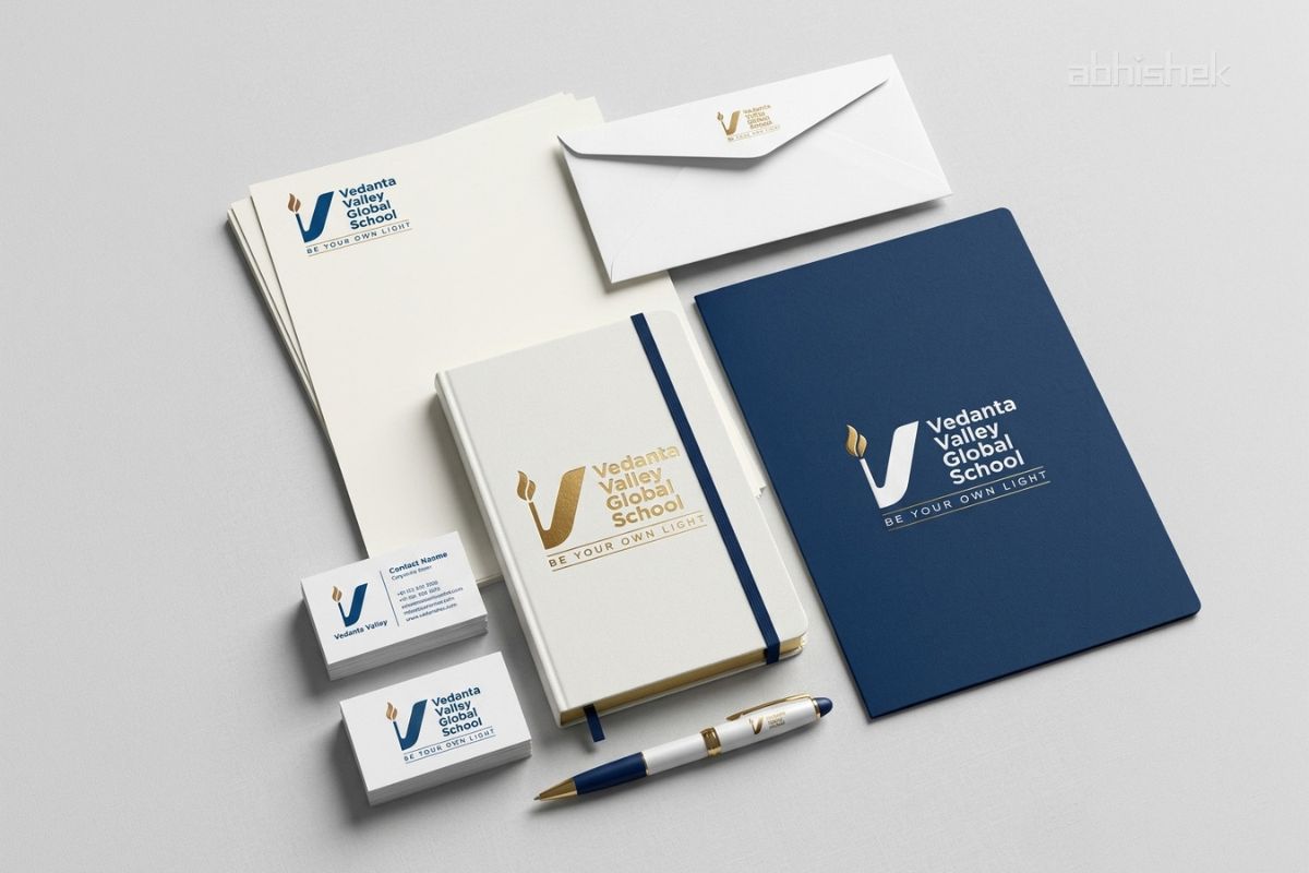
The educational logo identity needed to maintain consistency and clarity across:
- School uniforms
- Embroidery applications
- Student badges
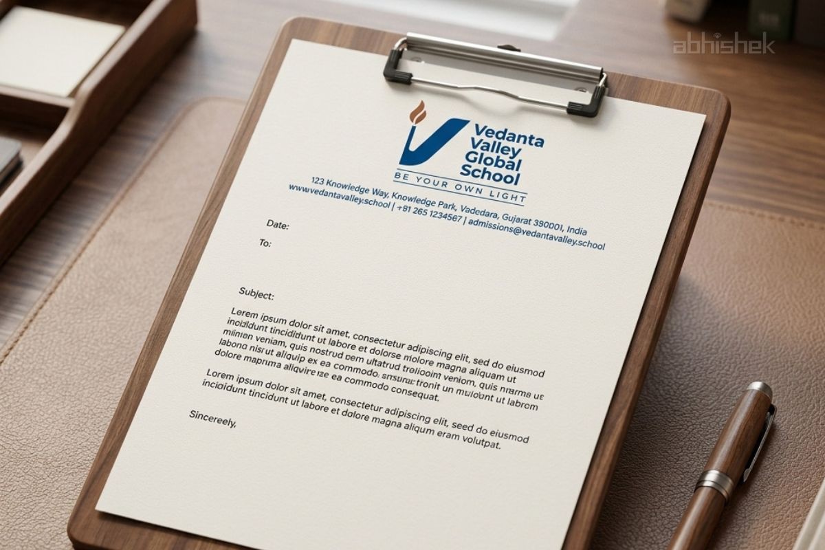
- School stationery
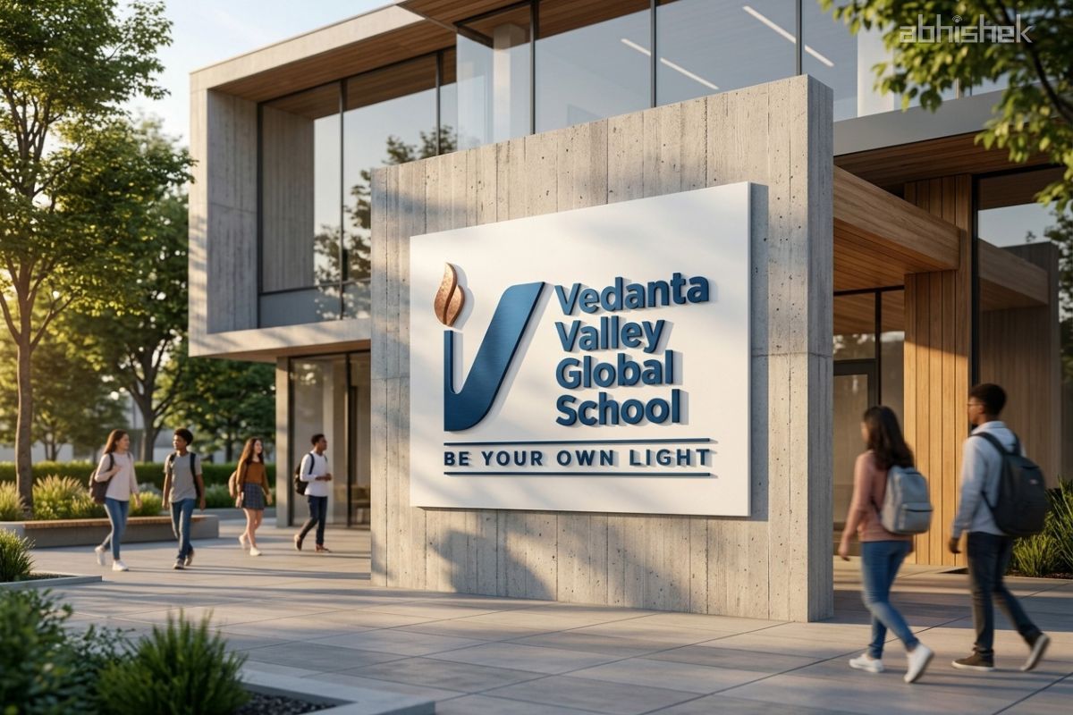
- Campus signage
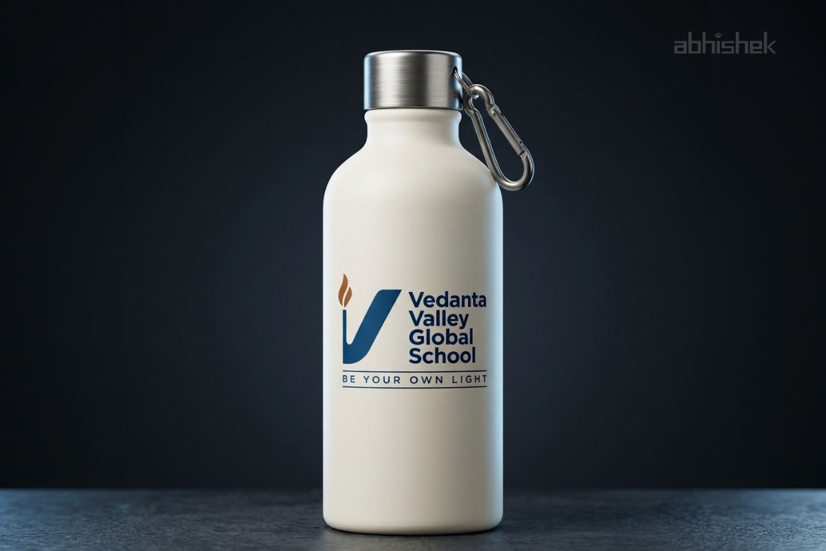
- Website and digital platforms
The challenge was to create a modern educational identity system that communicates growth, individuality, inquiry, and holistic learning without depending on literal academic symbols.
Client: Vedanta Valley Global School
Industry: Education / Global School Branding
Location: India
Project Timeline: 3–4 Weeks
Services Covered: School Branding, Educational Logo Design, Brand Strategy, Visual Identity Design, Concept Development
Project Status: Completed
Our Strategic Approach
At Abhishek Branding LLP, we approached this educational branding project with one clear belief:
Meaning should be felt, not forced.
Before beginning visual exploration, we focused on understanding:
- What should parents emotionally feel?
- What should students aspire towards?
- How should the institution be remembered years later?
This strategic clarity became the foundation for the complete educational branding system.
The entire identity direction was built around one central philosophy:
“Be Your Own Light.”
This thought became the core of the logo symbolism, visual storytelling, colour direction, and educational brand positioning.
✦ Brand Identity Development:
The educational identity system was intentionally designed to balance:
- Vedantic philosophy
- Scientific thinking
- Human values
- Individual growth
- Global educational outlook
The visual language focused on creating a timeless educational identity rather than a trend-based school logo.
The branding direction remained minimal, symbolic, intelligent, and emotionally meaningful to ensure long-term relevance.
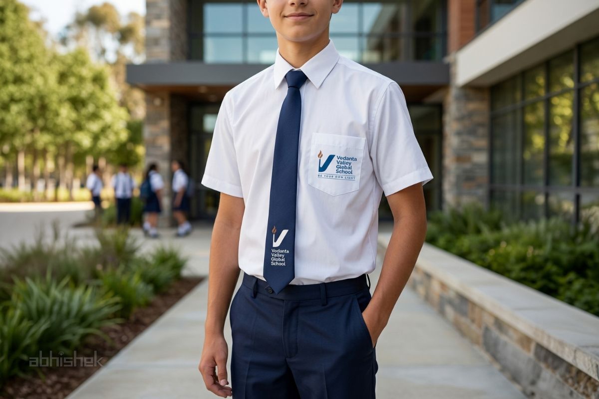
✦ Final Logo Concept & Symbolism
The final educational logo identity was developed around a symbolic and abstract “V” form representing both:
- Vedanta
- Valley
The upward flowing structure reflects:
- Growth
- Aspiration
- Student transformation
- Forward-thinking education
The golden flame element symbolises:
- Inner awakening
- Knowledge
- Enlightenment
- Self-discovery
This directly aligns with the institution’s philosophy:
“Be Your Own Light.”
The logo balances institutional discipline with human growth — creating a modern educational identity that feels rooted, premium, and globally aspirational.
✦ Educational Colour Psychology:
Colour psychology played an important role in shaping the institution’s educational perception.
The branding palette was carefully selected to represent:
- Blue → Trust, intelligence, clarity, stability
- Gold → Wisdom, enlightenment, aspiration
- Earthy tones → Rooted values and emotional warmth
This combination helped create a global school identity that feels professional, approachable, and timeless.
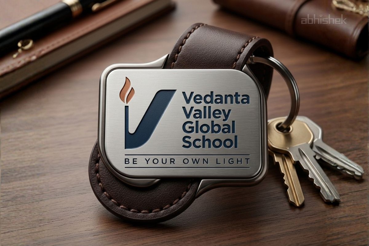
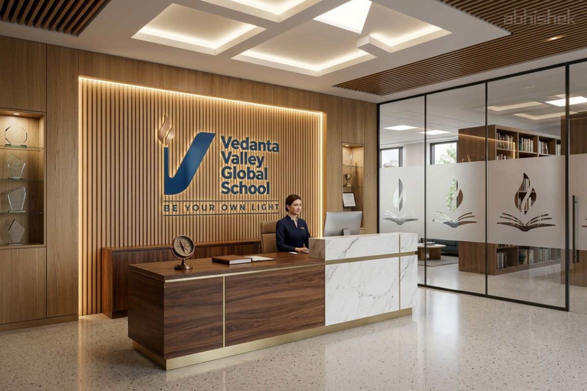
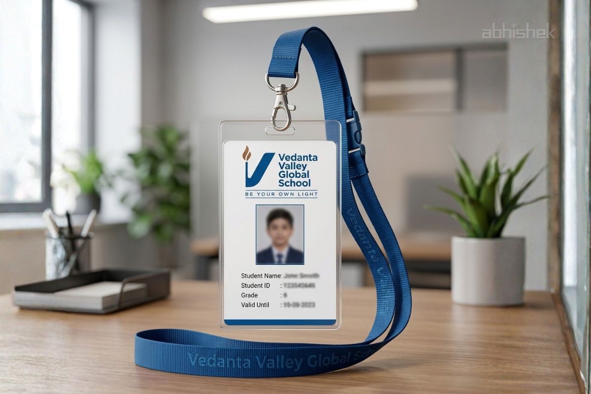
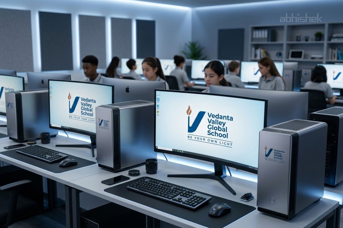
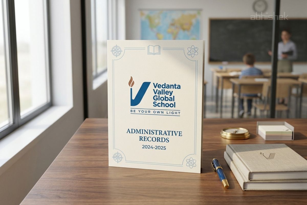
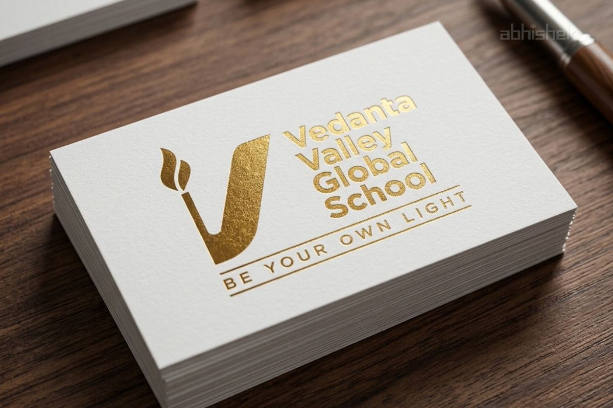
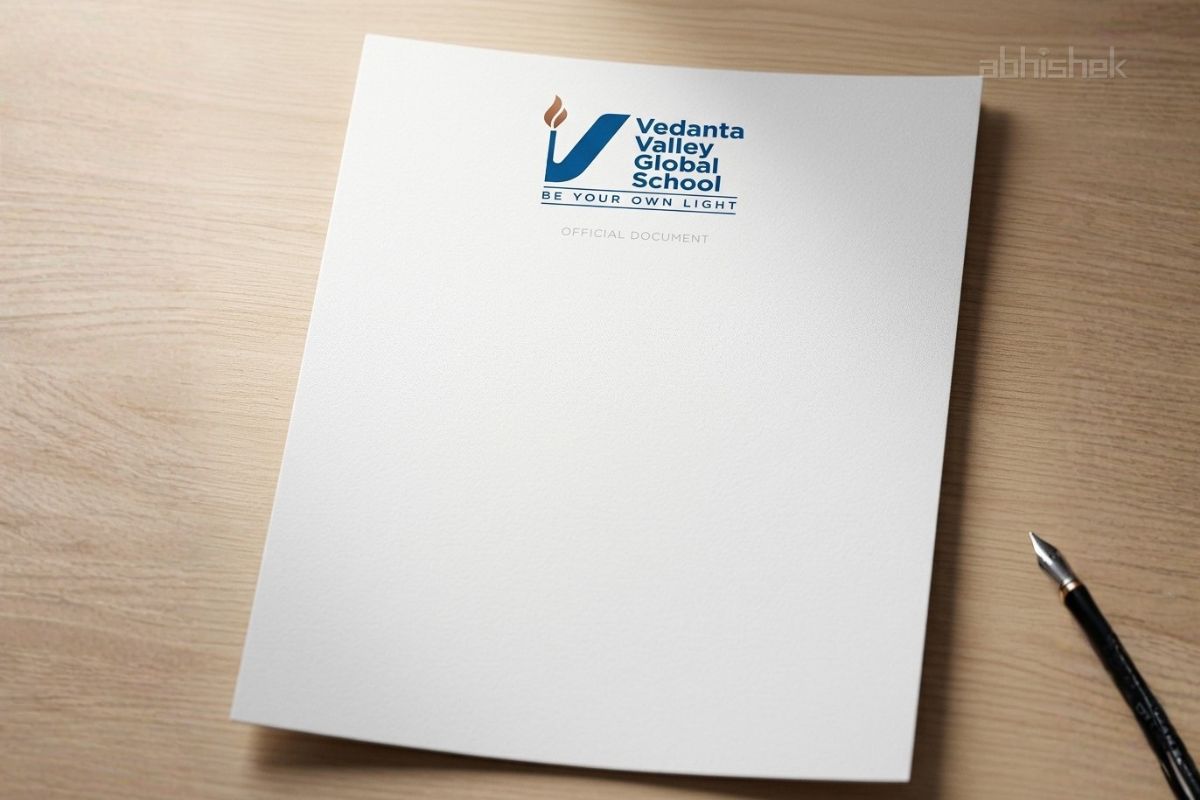
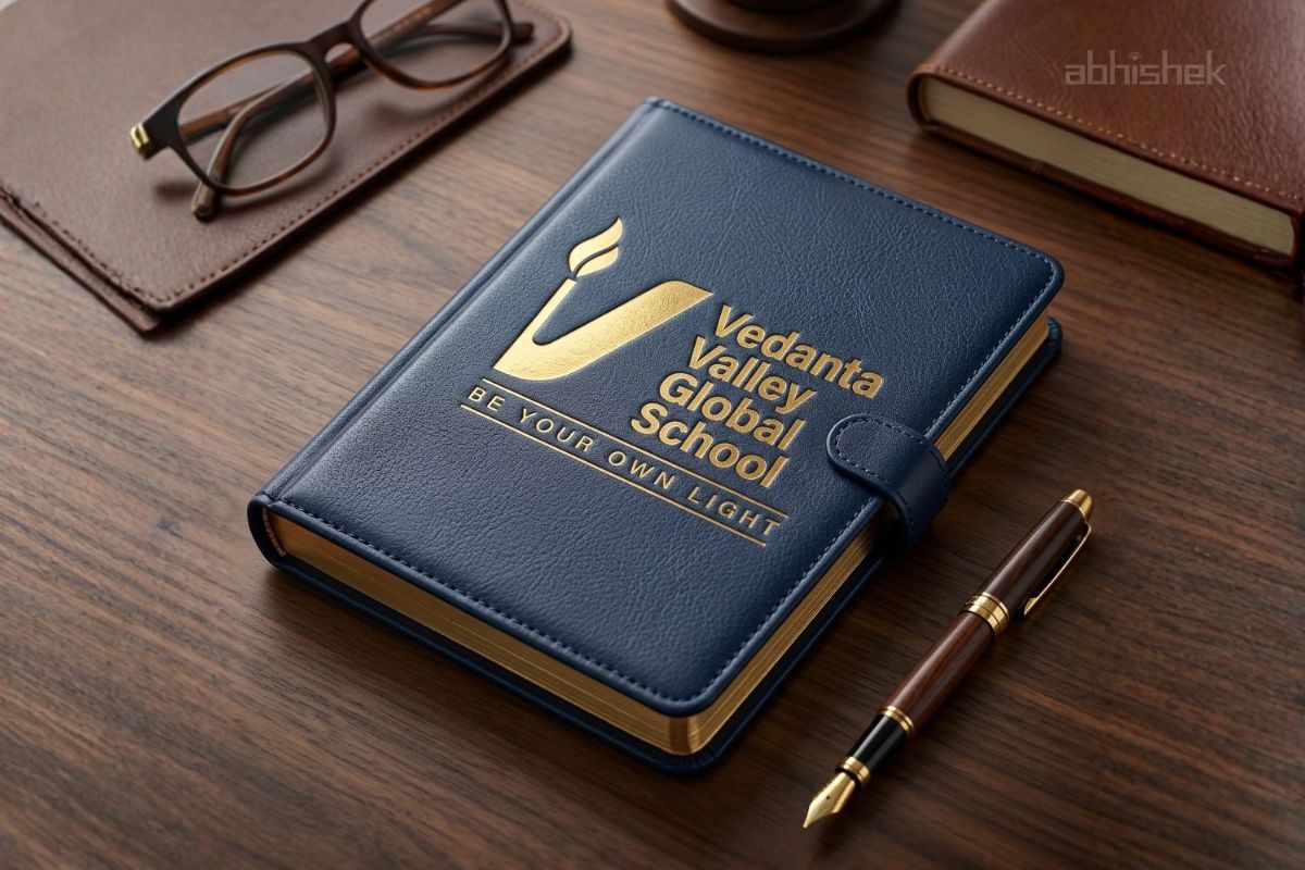
✦ Identity Designed for Real Applications :
The educational identity system was developed for practical usability across multiple branding touchpoints.
The logo was structured to maintain consistency and recognition across:
- School uniforms
- Embroidery and badges
- Printed stationery
- Campus branding and signage
- Website and social media platforms
- Merchandise and promotional materials
This ensured scalability and long-term consistency across all educational branding applications
Creative Direction by Brand Consultant Manish Vaishnav
With strategic consulting focused on educational philosophy, symbolism, and long-term brand clarity, Abhishek Branding LLP developed a meaningful educational identity aligned with the institution’s future vision.
Creative Direction
With strategic consulting and direction, the project was built on strong foundational thinking
1. Branding with Clarity:
Every design decision was rooted in philosophy rather than decoration.
The identity system focused on creating emotional and intellectual connection through symbolic simplicity.
2. Educational Identity Beyond Clichés:
The branding intentionally avoided predictable academic visuals and instead focused on meaningful educational storytelling.
3. Design That Connects Emotionally:
The visual language was crafted to feel aspirational for modern audiences while remaining emotionally relatable to rooted communities and families.
4. Strategy That Aligns Vision
Every branding touchpoint from logo identity to colour direction was aligned under one educational philosophy:
“Be Your Own Light.”
Outcome:
The project successfully transformed the institution’s educational vision into a timeless and differentiated global school identity system.
Key outcomes included:
- A meaningful and modern school logo identity
- Strong educational brand positioning
- Better emotional connection with parents and students
- Consistent branding across applications
- A premium yet approachable educational presence
Educational Brand Identity Showcase


![]()


