Pizza Restaurant Branding Case Study | California USA
Building a Consistent Restaurant Identity Across Menu, Packaging & Customer Touchpoints
Project Brief for Pizza Effect
Pizza Effect is a pizza restaurant located in Reseda, California, USA, serving classic favourites alongside distinctive flavour combinations inspired by Indian, Mexican, and contemporary fusion tastes.
Its menu goes beyond conventional pizza offerings, with options such as Paneer Tikka, Royal Butter Chicken, Royal Makhani Paneer, Schezwan Chili Chicken, Chorizo Pizza, calzones, wings, pasta, salads, and specialty crust pizzas.
With such a diverse menu and bold food personality, the restaurant needed a visual identity and communication system capable of bringing everything together under one recognisable brand.
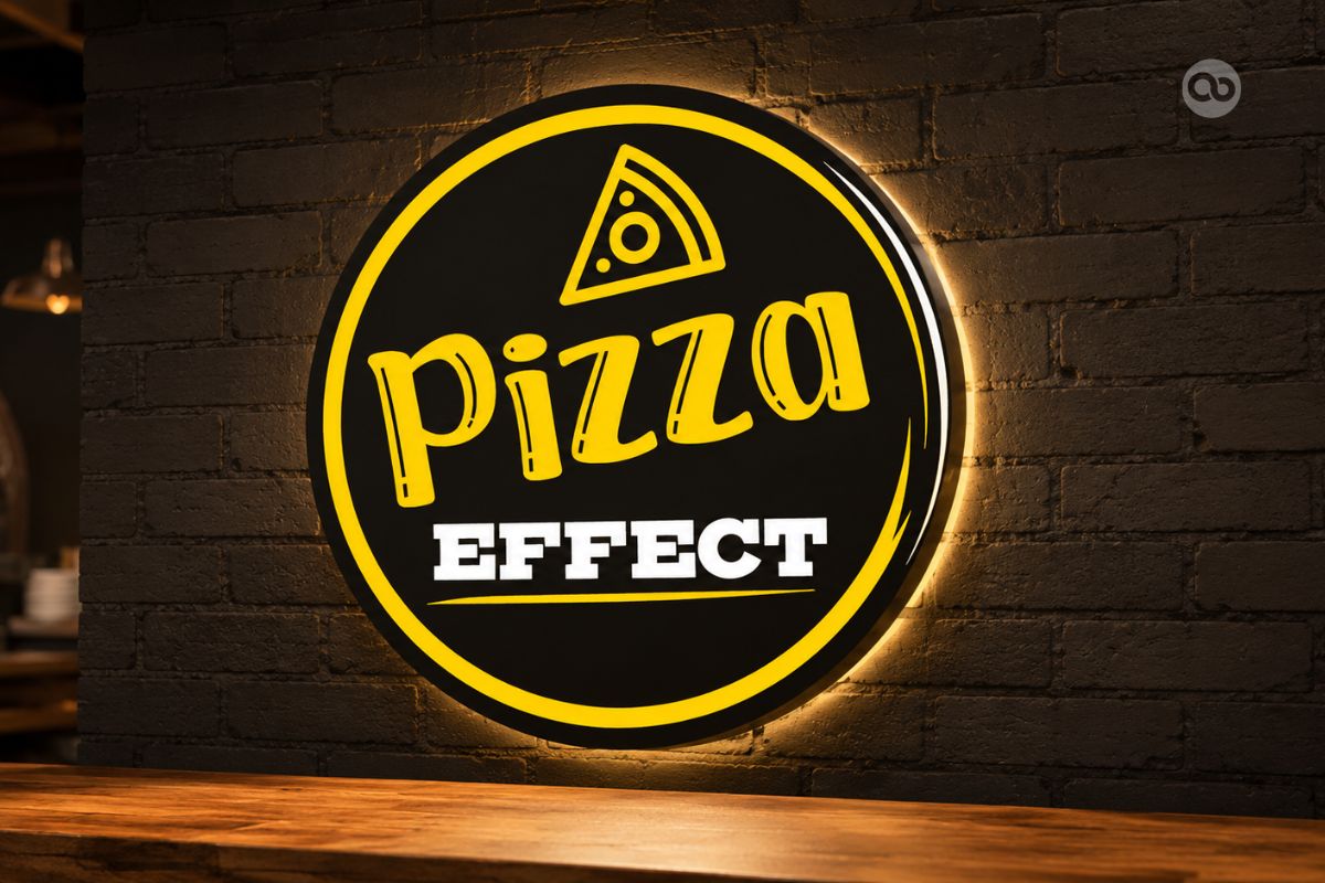
The client approached Abhishek Branding LLP initially with an AI-generated logo direction they liked. Our role was to professionally refine that idea and develop it into a practical restaurant identity that could work consistently across menus, packaging, promotional materials, and in-store communication.
Turning an AI Logo Idea into a Usable Brand Identity The client liked the concept of their existing AI-generated logo and did not want to lose its original character. Instead of starting over, we needed to understand what they liked about the concept, professionally redesign it, and make the identity suitable for real-world restaurant applications. |
Rethinking the Menu Design Direction The initial preference was for a dark-themed menu. During the creative process, we explored a lighter visual direction that offered better readability, cleaner food presentation, and more breathing space for a menu with many categories and combinations. The client preferred the lighter direction, and it became the foundation for the restaurant’s menu communication. |
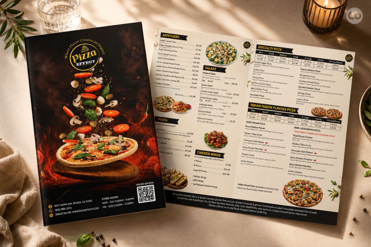
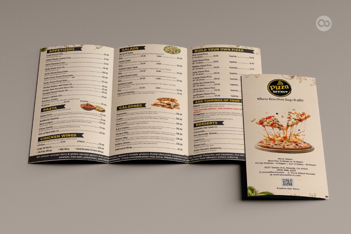
Fitting an Extensive Menu into a Z-Fold Format This became one of the project’s most interesting design challenges. Pizza Effect has an extensive menu with multiple pizza sizes, specialty flavours, appetizers, calzones, sides, and other food categories. The Z-fold menu, however, offered limited physical space. The Challenge Was Not Simply “How do we fit everything?” It Was “How do we fit everything without making it feel crowded?” Information hierarchy, category grouping, typography, pricing, spacing, and reading flow all had to work together within the restricted format. |
| Client | Pizza Effect |
| Industry | Pizza Restaurant / Fast Food |
| Location | California, USA |
| Project Timeline | Multi-stage Branding Project |
| Services Covered | Logo Redesign, Restaurant Branding, Menu Design, Z-Fold Menu Design, TV Screen Menu Design, Banner Design, Packaging Design & Brand Applications |
| Project Status | ● Ongoing |
At Abhishek Branding LLP, we approached Pizza Effect not as a series of individual design requirements, but as a connected restaurant branding system.
From menus and TV screens to packaging and takeaway communication, every touchpoint needed to feel visually connected.
The project began with an AI-generated logo concept that the client already liked.
Rather than replacing it, we retained its core character and professionally refined the identity for better structure, consistency, and practical use across restaurant applications.
The original preference was a dark-themed menu. We proposed a lighter direction to improve readability, food presentation, and visual clarity across Pizza Effect’s extensive menu.
Design Focus:
Visible Pricing •
Better Hierarchy •
Comfortable Reading
The client selected the light direction, which became the foundation for the restaurant’s menu communication.
The Z-fold menu had to accommodate a large number of food items within a limited folded format.
Categories, item names, pricing, spacing, and hierarchy were carefully organised to create a compact menu that remained clear and easy to navigate.
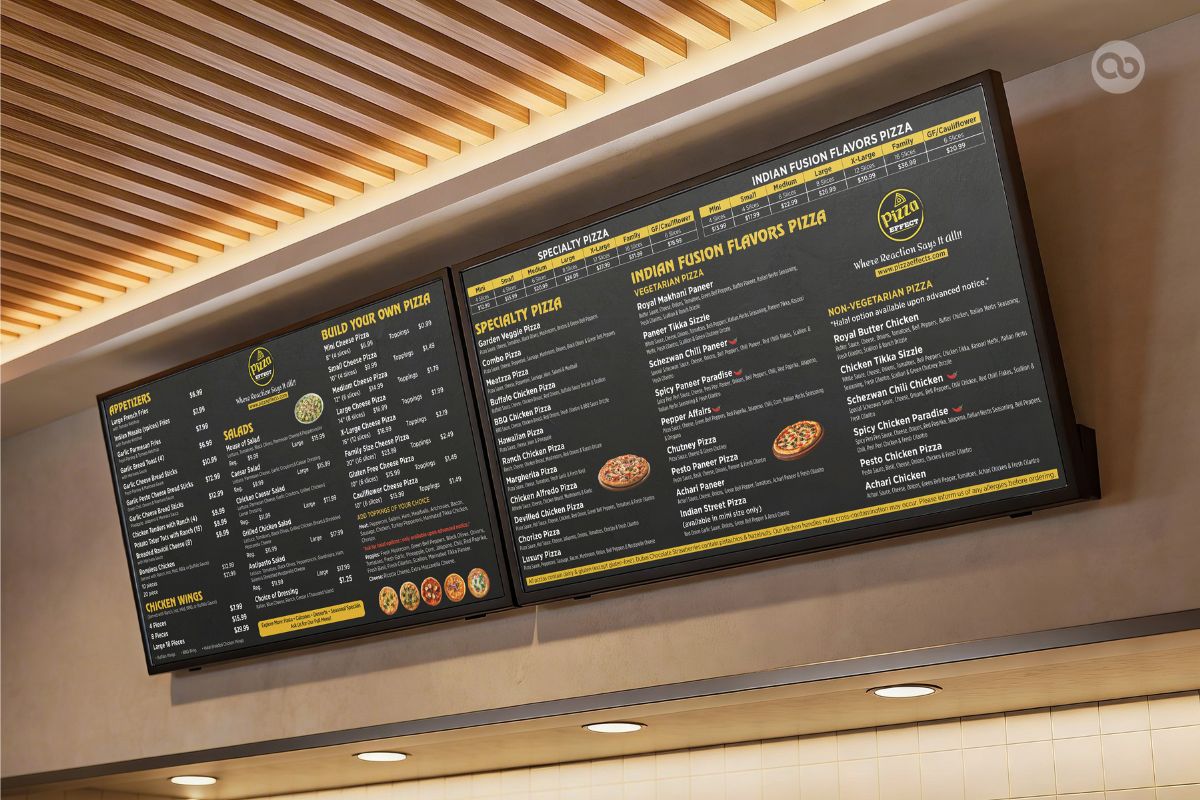
Unlike printed menus, TV screens need to communicate quickly and clearly from a distance.
Screen Priorities:
Clear Categories •
Visible Pricing •
Balanced Information
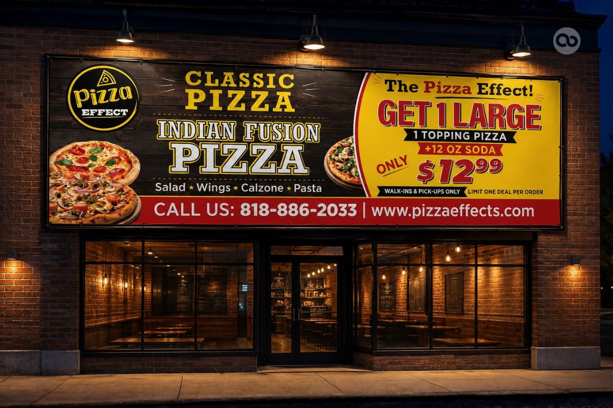
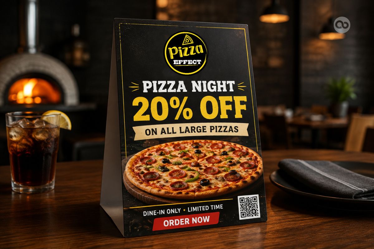
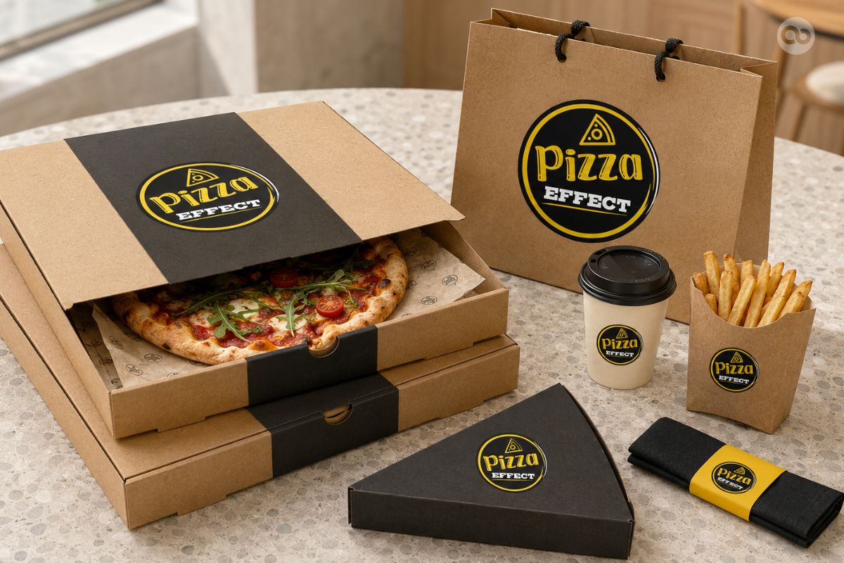
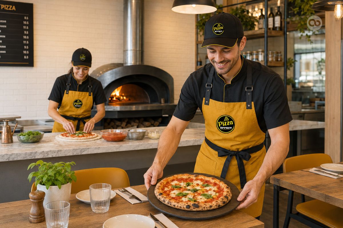
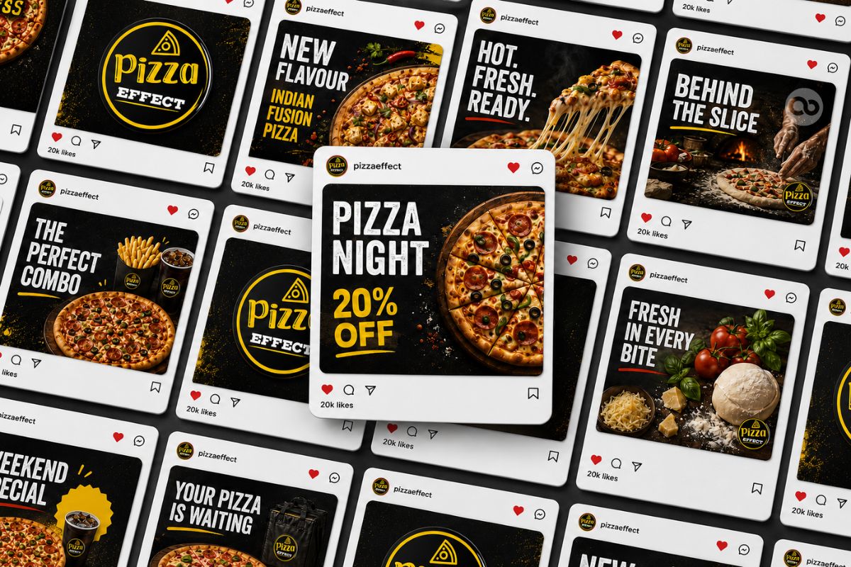
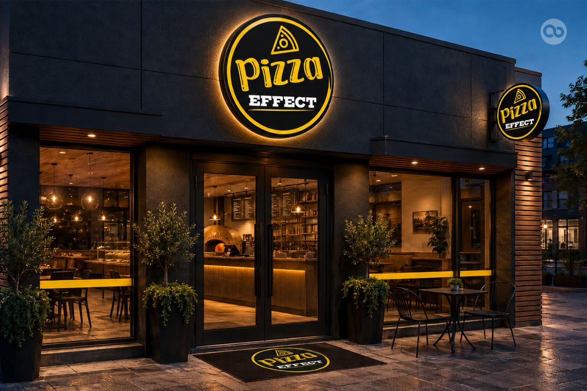
The Pizza Effect identity was extended across restaurant banners, promotional materials, packaging, and other customer-facing applications.
Maintaining the same typography, hierarchy, and visual language helped create a consistent brand experience across dine-in, takeaway, and delivery touchpoints.
Creative Direction by Brand Consultant Manish Vaishnav
With strategic and creative direction led by Brand Consultant Manish Vaishnav, Abhishek Branding LLP developed the Pizza Effect identity across multiple restaurant communication requirements.
Outcome:
What started as a logo refinement developed into a broader restaurant branding system for Pizza Effect.
The project established a consistent visual direction across:
- Logo identity
- Restaurant menu
- Z-fold takeaway menu
- TV screen menu
- Restaurant banners
- Packaging
- Promotional communication
- Other customer-facing brand applications
The result was a more organised and cohesive restaurant identity designed to support Pizza Effect’s diverse menu and multiple customer touchpoints.
Pizza Restaurant Brand Identity Showcase