")
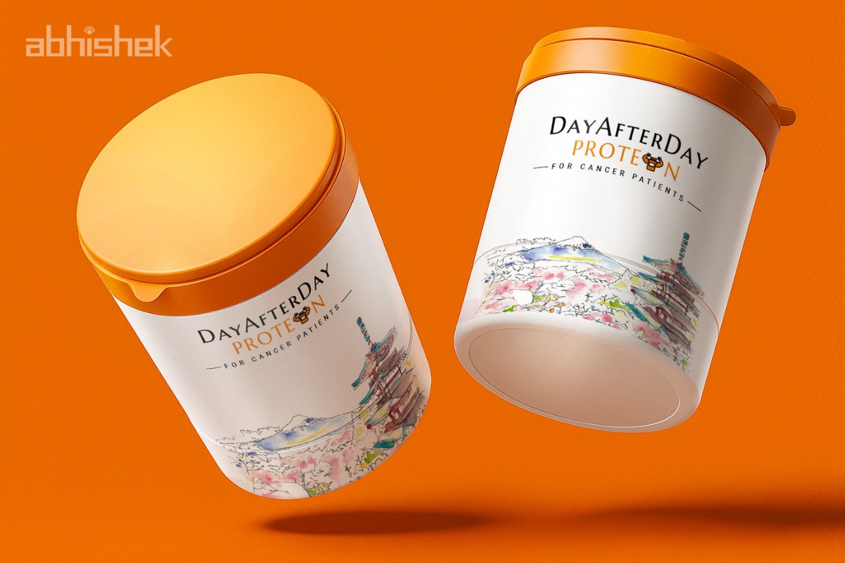
Protein Powder Packaging Design – Day After Day Protein
Project Brief for Day After Day Protein:
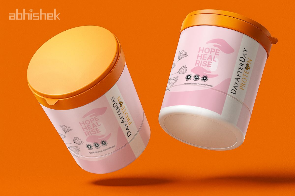
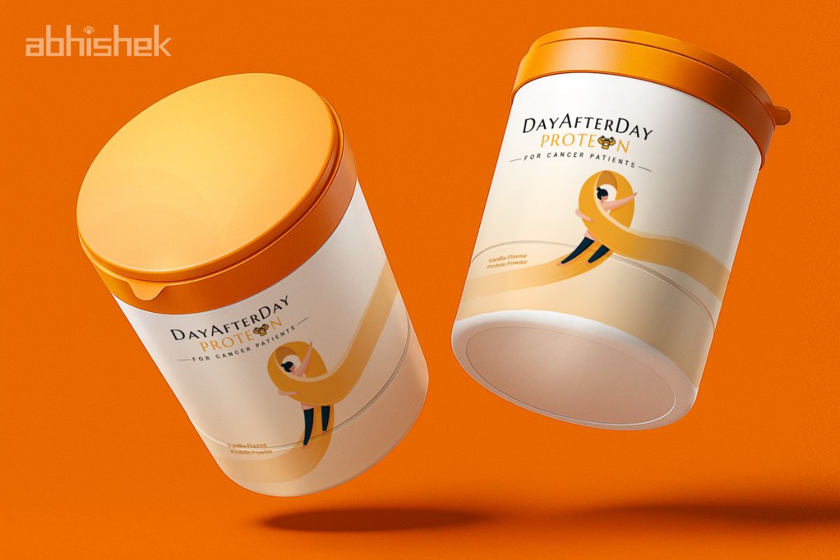
Akimoto Pharmaceuticals, a trusted name in healthcare and pharmaceuticals, has launched a new sub-brand, Day After Day Protein, developed for patients recovering from cancer treatments, surgeries, and long-term medical care.
The requirement was not just to design attractive packaging, but to ensure the sub-brand carried the pharma trust of Akimoto along with a premium, patient-friendly identity that could connect with both doctors and end-users.
Challenge:
Designing for a sub-brand in the medical nutrition category demanded a delicate balance:
Doctors prescribe it, expecting packaging that reflects scientific accuracy, pharma credibility, and reliability.
Patients and caregivers also purchase it directly, expecting a product that feels reassuring, approachable, and premium.
The challenge was to design a sub-brand identity that worked in both medical and retail contexts, ensuring the strength of Akimoto Pharmaceuticals carried forward while establishing Day After Day Protein as a caring, distinct offering.
Client: Akimoto Pharmaceuticals
Industry: Pharmaceuticals
Location: Mumbai, India
Project Timeline: 15 Days
Services Covered: Premium Packaging Design
Project Status: Completed
Our Strategic Approach
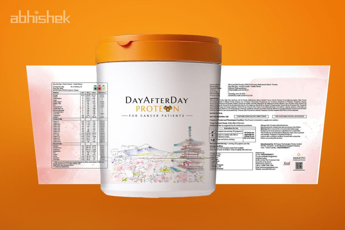
At Abhishek Branding LLP, we believe design begins with empathy, not aesthetics. For this project, our approach was guided by one principle: minimalism that communicates trust & care.
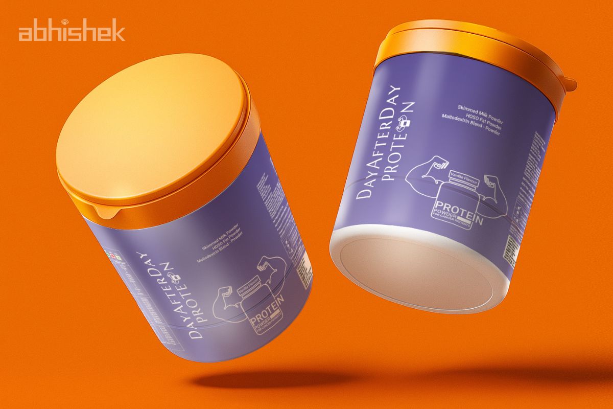
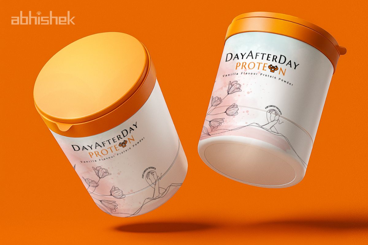
✦ Sub-Brand Alignment :
Ensured the packaging of Day After Day Protein reflected Akimoto Pharmaceuticals’ trust, while maintaining its own distinct premium look
✦ Premium Yet Patient-Friendly:
We avoided loud visuals and embraced soothing, mild colours that bring calmness to sensitive patients.
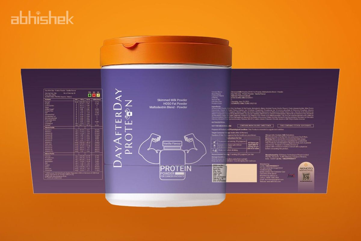
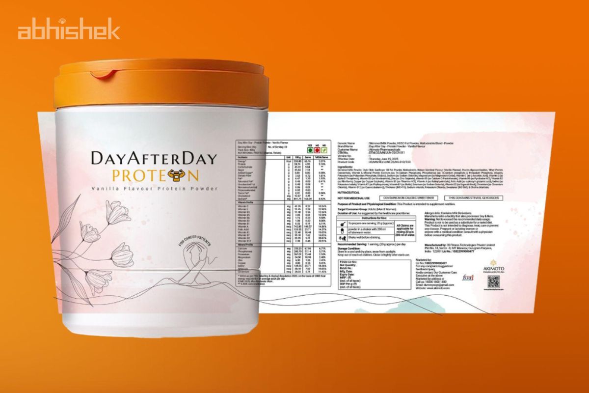
✦ Science + Warmth Together :
Fonts and layouts met pharma standards, while subtle design motifs added a sense of continuity and support.
✦ Symbolism That Matters
Inspired by the brand name “Day After Day”, the design language expressed progress, healing, and reliability.
✦ Consistency Across Formats
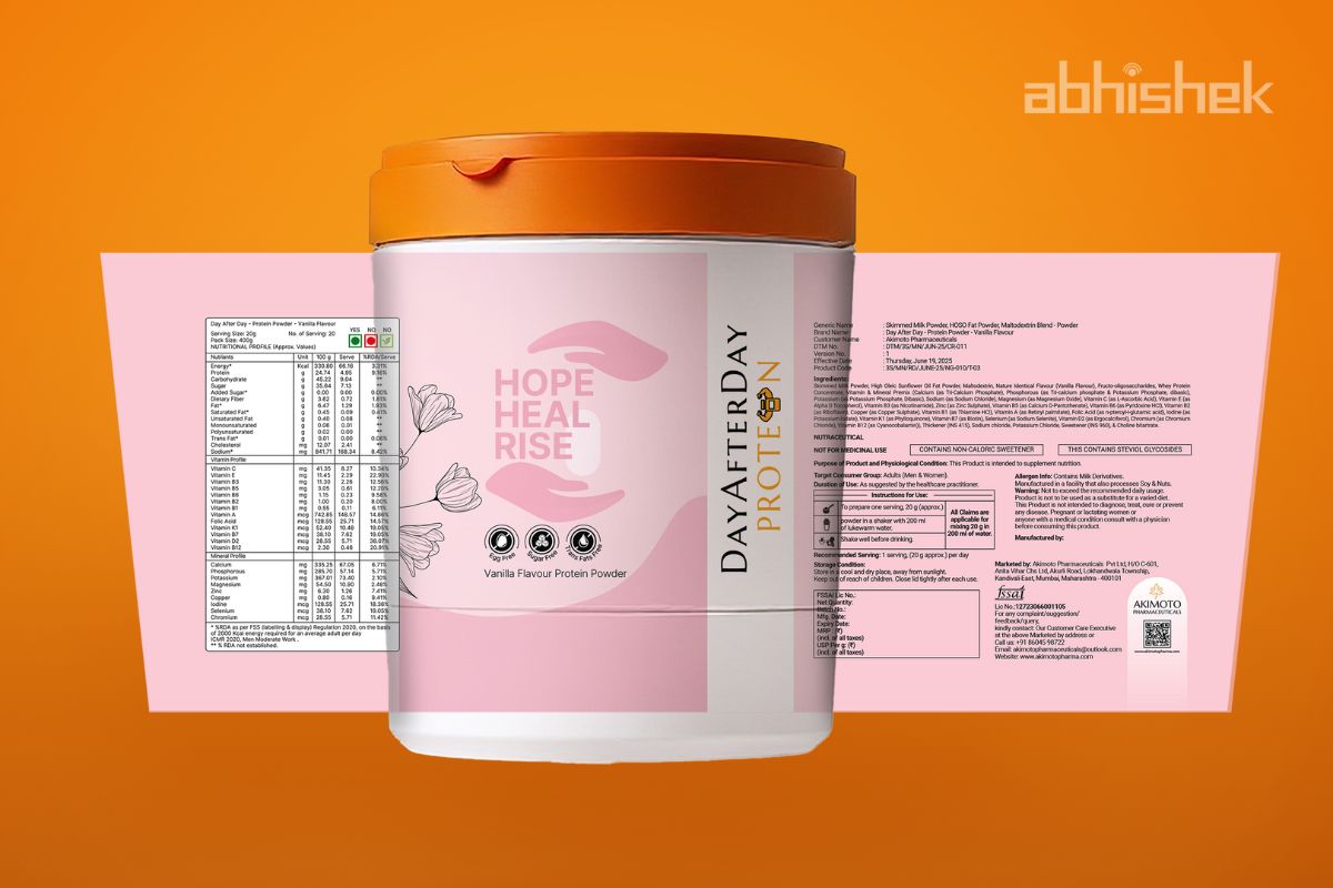
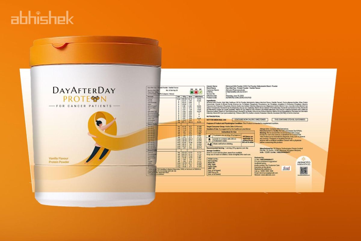
Whether in jars or sachets, the identity was kept uniform and clear, ensuring professional trust and consumer confidence.
Creative Direction by Brand Consultant Manish Vaishnav
With consulting led by Manish Vaishnav, Abhishek Branding LLP delivered a culturally rich
and market-aligned restaurant launch strategy from identity packaging design.
1. Packaging with Care:
Every decision was rooted in compassion — creating a design that patients and caregivers would instinctively trust.
2. Minimalist Premium Appeal:
By keeping the packaging uncluttered and elegant, the product stood apart as a premium yet sensitive choice.
3. Design That Builds Trust:
Balanced the seriousness of pharma design with a human touch, suitable for both doctors’ recommendations and direct consumer purchase.
4. Strategy That Performs
The final packaging established dual-channel strength: credibility in the medical community and appeal in the retail space, without compromising either.
Results:
- Delivered a packaging system that worked equally well for prescribed use and direct sales.
- Reinforced Akimoto Pharma’s image as a caring, premium healthcare brand.
- Demonstrated that great design is not only about visuals — it is about understanding sensitive needs and translating them into trust-building solutions.
Protein Powder Packaging Design
![]()


